Month: September 2015

Current Power BI Service Limits

Not long ago, Microsoft announced that the limits for Datasets and Reports per Dataset had been increased to 200. You can read their announcement here. That raised some additional questions for me. I asked Microsoft and have now gotten the answers I sought.

Please note that these answers are valid as of September 23, 2015, but are subject to change in the future.

image

Datasets

A Dataset is a connection to a single source of data, a single file, a single database, etc. So, this means you can connect to up to 200 distinct sources from your Power BI service account. Note that a Power BI Desktop file, which can connect to many sources at once, counts as a single Dataset in the Power BI service. Therefore, effective use of Power BI Desktop raises your limit of data sources well above 200.

NOTE: I don’t, as of the time of this writing, have the limit on sources supported by a Power BI Desktop file. I will provide that info once I have it.

Reports per Dataset

A Report in Power BI connects to one and only one Dataset. If you think 200 Reports per dataset does not seem like much, remember that Reports can have multiple pages of visualizations. I don’t have a maximum on number of pages at the moment.

NOTE: I got confirmation from Microsoft that tiles created via Q&A DO NOT count against this 200-Report limit. So, with effective use of Q&A for creating Dashboard tiles, you can get a lot of mileage out of 200 Reports by only using them for things that a Q&A tile cannot do.

Reports

With 200 Datasets each supporting up to 200 Reports, some simple arithmetic leads to the conclusion that you can have up to 40,000 Reports in your Power BI account. I have not seen an Enterprise environment with anything close to that number of Reports. I would think they could be out there, but, still: That’s a LOT of Reports.

Dashboards

You can have up to 100 Dashboards in your Power BI account. To me, this is the most limiting out of all of these numbers. The reason is that there is no real wiggle-room here as there is no comparable alternative to Dashboards. While there is not a technical reason that dictates your Dashboard tiles have to all fit on a single screen without scrolling, it is definitely a best practice to keep them to a single screen. Still, if you remember that your dashboards should be for the MOST important information that needs to be seen at a glance, you can make good choices about what gets pinned to Dashboards and what stays on the underlying Report(s). Keep in mind, too, that Dashboards can support Tiles from multiple Reports and from multiple Datasets via Q&A. So, it is possible to to have multi-purpose Dashboards if you are approaching this limit. That said, I would recommend you avoid mixing unrelated data in the same Dashboard as it could create confusion and make the Dashboard less effective overall.

Conclusion

There you have it. I hope that provides some clarification. I have to say, for a service with the elegance and flexibility of Power BI, and price points of FREE and $10/Month, these limits are VERY generous.

PASS Board of Directors Election

Greetings. It’s time to vote for the open PASS Board of Directors positions. I want to start by thanking some folks.

Thank you to the Nomination Committee for their time and effort on this process:

Bill Grazziano
Grant Fritchey
Robert Davis
Lori Edwards
Bob Pusateri

I would like to thank the four candidates, all of whom have shown a passion for this community, not just with their words, but with their actions.

Ryan Adams
Tim Ford
Argenis Fernandez
Jen Stirrup

This is never an easy decision to make. I know each of these great people and have no doubt that the outcome would be great for PASS for any of them to sit on the Board.

Here are my votes, with the rationale behind each.

Jen Stirrup

I know that Jen is the only candidate for EMEA and a vote here isn’t really necessary. I am voting for her anyway because I have tremendous respect for her and the work she has already done on the PASS Board. I love how great she has been in terms of transparency. I love how she has served as a champion for the data professionals out there that aren’t DBAs or Database Developers. While the core of PASS has long been, and continues to be, with our Database Administrators and Developers, it is vital, in my opinion, for PASS to also embrace the data analysts, data scientists, and consumers of data. One way is via the PASS Business Analytics Conference. Our DBA and Database Developer friends put a lot of time and effort into helping to store our vital data and keep it safe and secure. We keep and safeguard that data so we can USE it. Jen has served well in speaking for those people.

Tim Ford

Tim has shown excellent leadership in continuing the success of the SQL Saturday program, which I believe in very strongly. To me, between his direct involvement with SQL Saturdays, his efforts on SQL Cruise are also fantastic. I hope to do one some day. 🙂 I think Tim has demonstrated his passion and ability to lead and I would like to see him continue those efforts. I do also appreciate his support for the PASS Business Analytics Conference and serving that community.

Ryan Adams

I met Ryan Adams when I was a PASS Regional Mentor. We chatted at a Regional Mentor’s meeting at PASS Summit and participated in discussions at the PASS Chapter Leaders meeting as well. I was amazed to hear how he performed that role. I was amazed at his organization and his passion for his chapters and for PASS. He made me want to be a better Regional Mentor myself. I chatted a bit with the Chapter Leaders in his region. They were in awe at how helpful he was for them and had nothing but praise and appreciation for Ryan. I knew during those conversations that it was only a matter of time before I would see his name on a ballot for the PASS Board. I also knew that I would vote for him when it happened. The time has come.


I mentioned that this is a very hard decision. Argenis is a brilliant SQL Server professional with a tremendous passion for this community. I think he is a great candidate for the PASS Board. I have every confidence that we will see his name on a ballot again. At this time, I feel that my three choices above are the ones I need to make.

My fellow PASS members, I implore you to vote. Please make your voice heard.

Power BI Weekly Update: Oh, The Places You’ll Go

Microsoft has released this week’s update to the PowerBI.com service. You can find the details here. There are a few updates this week, but I want to focus on just one.

How many times have I added a Dataset and created a Report only to discover I did so in the context of the wrong dashboard? OMG so many times. I am a slow learner, apparently. Well, it no longer matters.

As of TODAY, when pinning a visualization to a Dashboard in the Power BI service (PowerBI.com), you get to select which Dashboard to pin it to. What??? I know! So cool. Not only that, but you can ALSO choose to create NEW dashboard during this process instead of pinning to an existing one.

I have broken this post into two sections. The first section will be a straightforward blog post on this new feature of Power BI. The second section will cover this feature again, this time via poetry as I channel my own inner Dr. Seuss.

Straightforward

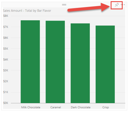
When you are choosing to pin a visualization (either in a report OR already on a dashboard) in the Power BI service, you now have some choices to make. Until today, those choices were made for you. Figure 1 shows a shiny new visualization I created against my Chocolate Sales dataset in a Report.

Figure 1

image

The Pin button is located in the upper-right, as shown by the red arrow in Figure 1. Yesterday, clicking that pinned that visualization to the last dashboard you visited. For me, that was often NOT the right one. And, since there was no way to change this after the fact, I had to delete that visualization (and sometimes entire Reports) and start again after going to the right dashboard, even just for a moment. Gr.

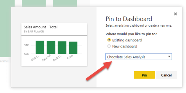
NOW, clicking that Pin button brings up the dialog shown in Figure 2

Figure 2

image

Bam! The dropdown list shown by the red arrow in Figure 2 contains the list of all my dashboards so I can select which one to pin my fabulous visualization to. OR, I can choose New Dashboard and have this be the first visualization on that dashboard.

The post from Microsoft referenced at the beginning also includes the ability to choose whether to use the theme of the dashboard or keep the formatting (colors) you have on the report. That option didn’t appear for me in this case. I’ll have to play with that a bit. For now, I wanted to focus on choosing the dashboard.

I am so very happy about this.

Dr. Seuss

Congratulations!
Today is your day!
You have Power BI!
You’re off and away!

You have data to use.
And questions to ask.
You can do it yourself.
You’re up to the task.
You head to the cloud, with that login you know.
To Power BI; you even have Pro.

You have your dataset already there.
You click on Explore and take to the air!
You click a few clicks and a bar chart appears
With no help at all! Hey, Microsoft: Cheers!

Your dataviz done, you just have to share.
You click on the Pin, and pin it to… where?
It went to some dashboard. You’re not sure which one.
You hope it’s the right one… It isn’t… Son (of a…)

Has this happened to you? Or friends that you know?
It’s happened to me. It ends happy, though.
Do not despair. Do not get the blues.
For as of TODAY: YOU GET TO CHOOSE!

Oh, the places you’ll go, now, when you pin your viz!
I hope I am clear on how awesome this is.

Power BI Weekly Update–Drill, Baby, Drill

In this week’s update to the Power BI service, Microsoft added the ability to drill down into hierarchies. You can read the announcement here. There are some other cool additions as well.

I thought I would take Drill for a spin and share my thoughts.

How to Use Drill

In my Free Power BI account (I have a Free one and a Pro one for testing, etc), I have a dataset related to students selling chocolate for a school fundraiser. I decided to be really cryptic and called it Chocolate Sales.

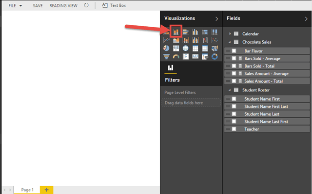
Figure 1 shows the empty palette.

Figure 1
image

To start, I’ll choose my visualization, the simple Column Chart, shown by the arrow in Figure 1. That leads to Figure 2.

Figure 2
image

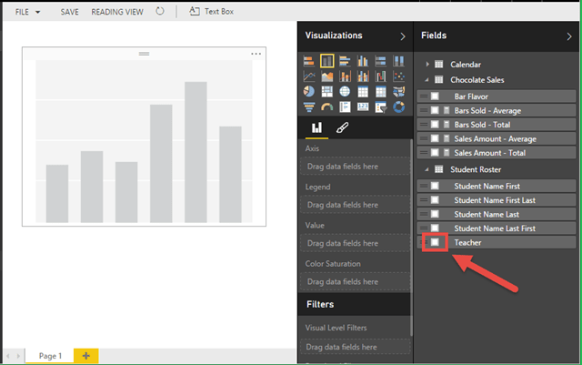
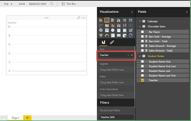
Figure 2 shows the empty Column Chart. I’ll click the box for the Teacher field, shown by the arrow. This leads to Figure 3.

Figure 3
image

The Teacher column now occupies the Axis of the chart. The next step requires some accurate mouse-work. You may want to stretch out a little. You don’t want to pull something. I’ll wait.

<pause>

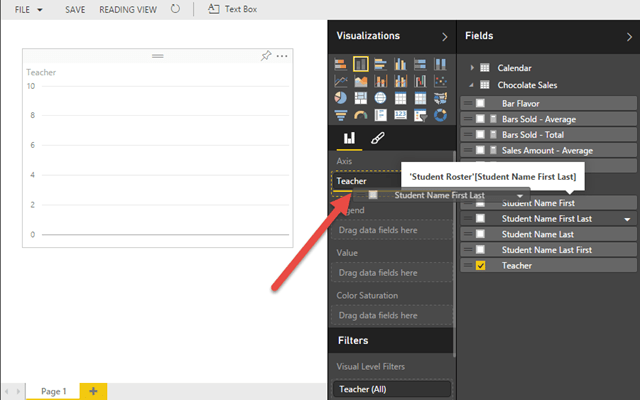
Cool. We want the drill path to lead from Teacher to Student Name First Last. So, when we click on a Teacher column in the chart, we want to drill to a column chart of the students in that class. To do that, we need to drag the Student Name First Last column into the Axis box UNDERNEATH the Teacher, as shown in Figure 4.

Figure 4
image

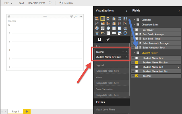
If done correctly, both Teacher and Student Name First Last will be in the Axis box, with Teacher on the top, as in Figure 5.

Figure 5
image

The order of the fields here is important.  The field at the top of the list in the Axis box will serve as the top level of the hierarchy, ie the top level of the drill path. Each other field below it will serve as a deeper level.

EDIT: I just played around with this more and putting the Student Name First Last ABOVE Teacher in the Axis resulted in the proper behavior anyway. So, perhaps there is some cardinality estimation behind the scenes to ensure proper behavior.

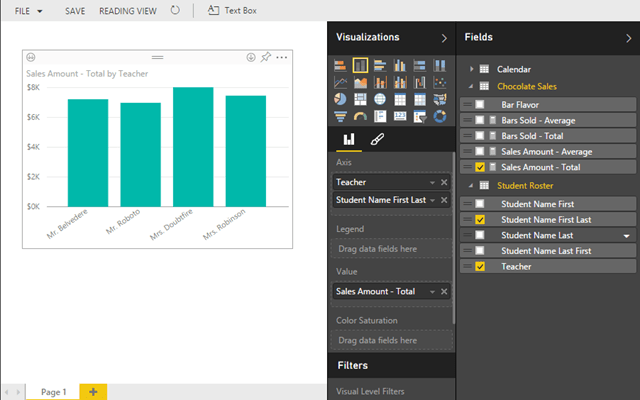
You can add more than one, but we’ll just use one to keep it simple. Our next order of business is to add a measure. For that, we can just choose Sales Amount – Total from the Chocolate Sales table, shown by the Blue arrow in Figure 5. The result is shown in Figure 6.

Figure 6
image

Here we have a fabulous Column Chart. Feel free to take a moment and soak it all in.

<Pause>

Life is good. OK. The default behavior when click on one of the columns is to filter this page of the report according to the value in that column. For example, if we click on Mr. Roboto’s column, it will cross-filter all other visualizations on the page to just Mr. Roboto’s class, as shown in Figure 7.

Figure 7

image

You can see in Figure 7 that the columns for the other Teacher values have become transparent, making Mr. Roboto stand out. Thank you very much, Mr. Roboto, for helping me demonstrate just what I needed to. Thank you. If we had other visualizations on this page, they would be filtered for just Mr. Roboto’s class.

In order to make the new Drill feature work, we have to change this default behavior to something new. First, we can click on Mr. Roboto’s column again to clear that cross-filtering. This takes us back to Figure 8.

Figure 8
image

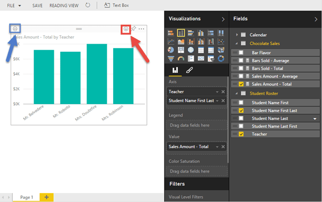
Notice the shiny new icon in the upper right of the chart, shown by the Red arrow in Figure 8. This is the Drill Down button. This changes the mode of the visualization to Drill Down mode instead of the default Cross-Filtering mode. I made those modes up. They are not official names or anything, they just seem to fit with the behavior.

In the upper left of the figure, shown by the Blue arrow, is the Drill Down Level button. We will come to that shortly.

For now, I’ll click the Drill Down button in the upper right, resulting in Figure 9.

Figure 9
image

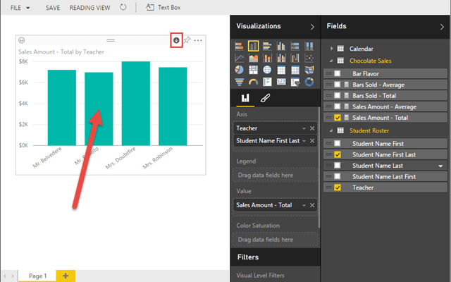
Notice the Drill Down button in the Red rectangle. It has reversed itself: instead of a dark arrow on a light background, it is a light arrow on a dark background. This is the subtle indicator that the Drill Down mode of the chart has been enabled. Now, if we click on the column for Mr. Roboto, we get the result in Figure 10.

Figure 10
image

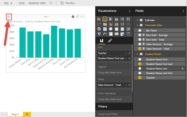
Instead of cross-filtering, we have drilled down one level from Teacher to Student Name First Last, showing the Sales Amount – Total for each student in Mr. Roboto’s class. Hazzah! We can then click the Drill Up button, shown by the Red arrow in Figure 10 to go back up to the Teacher level, as in Figure 11.

Figure 11
image

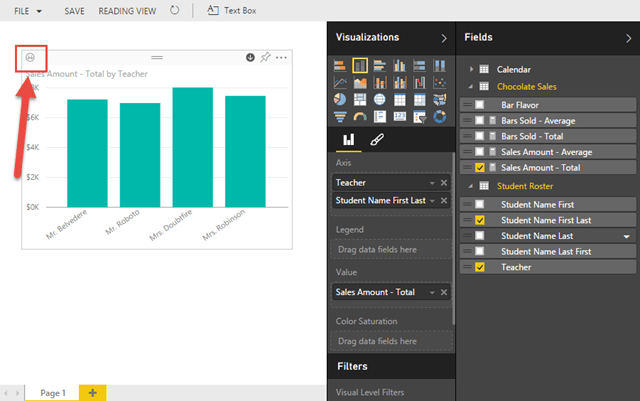
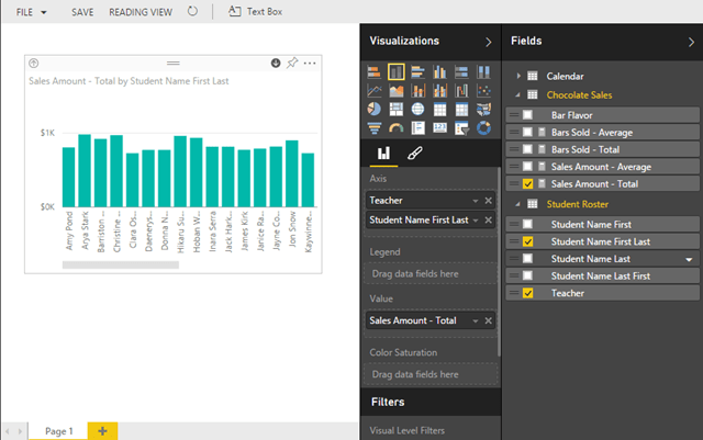
Now, the Drill Down Level button is shown by the Red arrow. This one will take us down to the next level, but apply no filtering. So, instead of getting to the Student Name First Last level for a particular Teacher, we get all of the students, as shown in Figure 12.

Figure 12
image

As you can see, there is a horizontal scroll bar on the chart now, indicating there are too many values to display in the space provided. This is because this chart now holds all students from all four classes.

That sums up the explanation of how to use this new Drill feature. You can turn off the Drill mode, and return to the default Cross-Filtering mode, by clicking the Drill Down button again.

My Thoughts

I am glad this feature is there, for sure. The ability to drill up and down through hierarchical levels is a really important bit of functionality. I also acknowledge that this is just the first pass at it. The fact that the Power BI team is able to keep going with WEEKLY releases here is outstanding. I must confess that I like the way this works in Power View better, where Drill is not a mode for the visualization, but an ability you use by double-clicking instead of single-clicking. That way, you do not have to choose between cross-filtering and Drill. As it is currently, you get one of the other, but not both. I do like, however, the Drill Down Level that lets you go down a level without having to filter. That can be quite handy at times. It will be great, at some point, to be able to guide the Drill to a new report that you have designed for the purpose of being the next level of Drill. But that is getting more structured, for sure, maybe a bit too structured for the current Power BI vision.

I hope you will try this out yourself. Power BI is such an exciting offering from Microsoft. Take it for a spin. If you haven’t already, head over to PowerBI.com and get a FREE account.

Power BI and The Open Bar

Back in July, the mighty Adam Saxton (Blog|Twitter) blogged about there being a limit of 10 reports per Dataset in Power BI. On your attempt to create your 11th report, you would get an error. Adam did point out, though, that you could have many pages within a report. That helped. That post from Adam mentioned above is no longer there because… <pause for effect> that limit has been raised to 200! Hazzah! Bar

I saw some grumbling over the 10-report limit. Granted, 200 is still a limit, but I feel there should be a limit. Power BI, after all, is currently an offering with only two subscription levels: FREE and $10/month. SOME manner of limit only makes sense. And 200 is definitely more than 10. It’s true. I looked it up on the Internet.

When the initial limit of 10 was announced, I asked for info from Microsoft on the maximum number of pages a Report could handle so I could write up a post and help spread the word and make sure people knew they could still do quite a bit even within that limit. When I checked back on the answer recently, I was told (per my Non-Disclosure Agreement with Microsoft) of the impending announcement and the new limit. Grand. That post would not be necessary. Hazzah, again!

This got me thinking, though. I felt the limit of 10 was pretty low and limiting, but I liked the fact that there was a limit. What???? You WANT to be limited???? Yeah. To an extent, I think it is a good thing. Here is the way I see it.

Events I have been to often have bars where people can get liquid refreshments. I, personally, seldom drink alcohol. But the vast majority of my friends do. To them, whether there is an Open Bar or a Cash Bar makes a difference. With an Open Bar, all drinks are paid for by the event rather than drinkers having to pay for them as they get them. With a Cash Bar, the drinkers have to pay as they go. I have often heard it said that an Open Bar leads to a lot more waste as people put their drinks down and forget them and just go get another cuz, hey, it didn’t cost anything. With a Cash Bar, people tend to pay more attention to their drink since they have made an investment of their own. I have not dug around in the data on this, but it seems reasonable, so let’s go with it for now.

When it comes reporting, a lot of organizations I have seen view their reporting environment, like SQL Server Reporting Services, for example, as an Open Bar. There is not a hard limit on reports. So, when in doubt, make a new report. Hey, it doesn’t cost anything, right? Ug. It actually does. Between the dev time for that report, and the testing (sigh, PLEASE test your reports, k?), and then resources involved in maintaining that report and perhaps running it via a schedule and dealing with issues, etc, there is very definitely a cost. When there is a limit on a resource, organizations tend (not always) to think more strategically about that resource. So, if you have a limit on the number of Reports you can create, you will think more about when to create a NEW report and when use an existing one that already has 99% of what the users are looking for. I have worked for several clients in a serious report sprawl situation. They may have dozens of copies of the SAME REPORT with the only difference being a hard coded value referring to a particular customer. Someone needs to learn about Parameters. But, I digress.

Even with this limit being raised to 200 in Power BI, my hope is that people take the few extra moments NOW to consider whether they REALLY need that new report, or if they can accomplish the same thing with what is already there. This hope applies to Enterprise reporting solutions (like SSRS) just as much, if not more than with Power BI.

Still, I have to hand it to Microsoft, here. It is a great example of customer feedback driving a change in a meaningful way. If you have feedback to offer around Power BI, please head over to http://community.powerbi.com/ and make your voice heard. Whether it be an idea for a feature or even just a question, the Power BI Community site is a great place to go.