Category: Power BI

How I Use the Microsoft Business Applications Release Notes For Power BI Roadmap

Microsoft has been publishing and maintaining Release Notes documents to share our plans for Dynamics 365 and the Power Platform (Power BI, Power Apps, Microsoft Flow, and the Common Data Service for Apps). You can find them here: aka.ms/businessappsreleasenotes. This set of documentation is grouped to align with the semester system upon which development of the relevant offerings is based. The link above will automatically take you to the most recent edition of the release notes, which, at this time, is the April ‘19 Release Notes (covering the semester from April 2019 thru September 2019).

On the Power BI Customer Advisory Team (PBICAT), we see a lot of questions about the roadmap for Power BI and other related technologies. Often, the answers can be found in the Release Notes. While the layout of the Release Notes is somewhat intuitive, it can still be daunting for folks who are not used to them to find the information they need.

And so it came to pass that I decided to write a blog post on how I navigate the Release Notes, which I use daily in my role on PBICAT. I will be focusing on Power BI for this post, but the pattern is consistent across the other covered technologies. Behold.

What are Release Notes?

The Release Notes provide information on features that are planned for release during the relevant semester. The key word here is PLANNED. As the overview on the landing page indicates, “These release notes describe functionality that may not have been released yet. Delivery timelines and projected functionality may change or may not ship (see Microsoft policy).”

This is important. A feature appearing in the Release Notes with a particular release target date (sometimes just year and month) is not a 100% commitment. Sometimes, plans need to be adjusted.

The Release Notes Are a Living Document

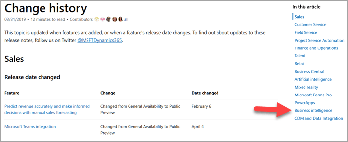
We update the Release Notes when our plans adjust. In order to make it easier to track what has changed, the left navigation pane of the Release Notes includes a page for Change History, as seen in Figure 1.

Figure 1

The Change History page will list modifications to the Release Notes that have occurred since the original publishing of the document for that semester. The right navigation pane, shown in Figure 2, lists the technology areas for which there have been changes, including a link to that list of changes.

Figure 2

For Power BI, we will choose the Business Intelligence entry, shown by the arrow in Figure 2. This will list out the changes to the Release Notes with respect to Power BI Desktop, Power BI Service, etc, as shown in Figure 3.

Figure 3

This allows you to see exactly what change was made and the date the Release Notes were modified to reflect that change.

Since changes to this document can happen at any time, I personally always use the online version of the Release Notes rather than downloading the PDF. The PDF is not maintained with the same frequency of the online version. For example, in Figure 3 above, you can see changes for Power BI Desktop occurring on March 15 and March 18. At the time of this writing, the PDF of the April ‘19 Release Notes was last updated on March 29th. If you need to use the PDF from time to time for offline viewing, etc, just make sure to check back to the online version on a regular basis to see any changes that have occurred.

The Business Intelligence Section For Power BI

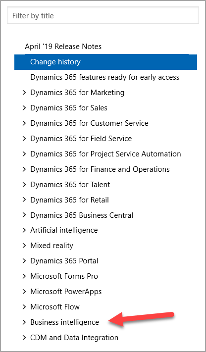
In the left navigation pane, which is visible regardless of where you are in the online Release Notes, there is an entry near the bottom for Business Intelligence, as seen in Figure 4. You will also notice that you can filter this list by title.

Figure 4

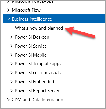
Clicking on Business Intelligence expands that section to reveal subsections for the different area of Power BI, as seen in Figure 5.

Figure 5

Typically, the first place I go is the What’s new and planned page, show with the arrow in Figure 5 above.

This wonderful page has the full listing of planned features, organized by the area of Power BI (corresponding to the sections in Figure 5). For each feature, you can find the type of release (General Availability, Public Preview) along with the target Date for that release, as you can see in Figure 6.

Figure 6

More often than not, the Date will just be a Month and Year. As the description at the top of this page indicates, that means that the release is planned to occur at some point within that month.

The What’s new and planned page is the only one (for each technology) that lists the target dates for the releases. Since “When is X supposed to come out?” is a very common question I get, starting in the What’s new and planned page will typically get me what I need.

Also, just like on the Change History page, there is a right navigation pane that allows you to skip to a particular area of the product, as shown in the circle in Figure 6.

Note: Remember that this is a living document. Thus, the dates shown in Figure 6 and elsewhere in this post are current as of the time of this writing, but could change at any time. So, make sure you use the real Release Notes for these dates and don’t rely on this post for that.

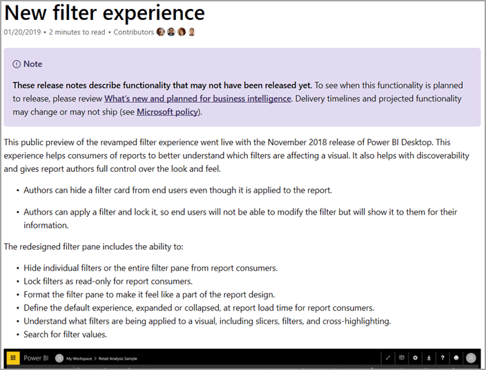
From here, you can click on a Feature to get more details around what is planned. For example, if we click on “New Filter Experience,” shown by the arrow in Figure 6, we go to the detail page for that feature, as shown in Figure 7.

Figure 7

The amount of detail in each Feature page will vary based on what the Feature owner has chosen/is able to share.

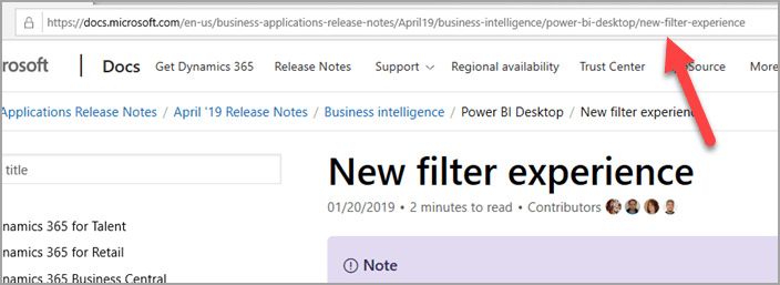
I also want to point out that each detail page has a link to take you directly to that page without having to navigate to it again from scratch. This is shown in Figure 8.

Figure 8

I think this is important because it allows you to easily share the details of a feature you are excited about with your colleagues, your boss, your mom, or whoever else.

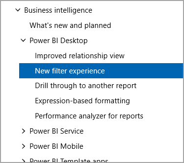
Also note that when navigating to the detail page for a feature, the left navigation pane expands to show you where that sits in the overall structure, as shown in Figure 9. You can, if you like, navigate to the detail pages this way instead of going through the What’s new and planned page. The path you take can vary based on what you need at the time.

Figure 9

What About Power Query and the Gateway and Connectors?

Connectors, Power Query, the On-Premises Data Gateway, etc are owned by the Data Integration team as opposed to the Power BI team. This is because they are not particular to Power BI, but rather to the Power Platform, etc, as a whole. Thus, the CDM and Data Integration section is where you will find the Release Notes entries for these and other features, as shown in Figure 10.

Figure 10

Wrapping Up

I hope this helps make navigating the Release Notes a bit easier. I know it is a big place with a lot of moving parts, so it can be a lot to take in when you are not used to it. But, once you have a better understanding of how things work, it becomes an easy and super valuable source for roadmap information.

Introduction to R Scripts in Power BI Desktop

Since I started learning R, I wanted to play a bit with the use of R scripts in Power BI Desktop. Note that my R skills are very basic, so please don’t use this post as an example of top-notch R.

At this time, there are three places in Power BI Desktop where you can use your own (or blatantly stolen from the Internet) R scripts. R can be an excellent option for adding prediction to your data models. For each, I will demonstrate how to do it as well as show the overall conceptual data flow. For Report View, I will show two examples since there are two conceptual data flows that are supported when using an R script in Report View.

1. Query Editor – Source

2. Query Editor – Transformation

3. Report View – Using Power BI Desktop Data Model

4. Report View – Bypassing Power BI Desktop Data Model

There will be some overlap between my content here and the official Microsoft documentation via the sites below. My hope is that this post can augment the well-done docs that exist already by adding my own thoughts on this.

Run R Scripts in Power BI Desktop

Using R in Query Editor

Create Power BI Visuals Using R

You can also use R-based custom visuals in Power BI Desktop. However, you use those like any other visual rather than supplying your own R script. Since the focus here is on using your own R script, I decided not to discuss R-based custom visuals in this post.

Note on the Format of This Post

As you no doubt follow my blog with rapt joy, you will know that I usually walk through step-by-step instructions with numbered lines of text like the following:

1. Do this thing. It should look like Figure A.

Figure A

2. Now do this other thing. It should look like Figure B.

Figure B

For this post, I decided to start using the numbered stamps available in SnagIt (I LOVE THIS TOOL) so that the images themselves will walk through the steps as much possible. To that end, as you read this post, I would love to get your feedback on how this works for you, dear reader. If you feel strongly, or don’t, I would appreciate your thoughts in the comments section below. Thanks.

Prerequisites

All of the options I will show require you to have R installed on your machine. I am using R version 3.4.3 I got here as well as R Studio (an IDE: Integrated Scripting Environment) version 1.1.383 I obtained here. You can also use Microsoft R Open, which you can get here. All are free. I am choosing base R and R Studio because I want to play with/show the use of non-Microsoft tools in conjunction with Microsoft tools. I am using 2.53.4954.481 64-bit (December 2017) of Power BI Desktop. Note that things could look/behave differently in other version of Power BI Desktop.

For this post, I am using a well-known dataset known as the Iris dataset, which you can read about here. I downloaded the zip file from here to obtain a csv file of the data set for one of my examples. The Iris dataset is also included in the “datasets” package in R Studio, which I will use as well.

Note: A key R concept to understand is that of a data frame, which is essentially just data in a tabular format. In a data frame, the “columns” are actually called “variables.”

Once you have R and an R IDE installed, Power BI Desktop will detect them. You can see this in the Power BI Desktop Options. You can follow numbered steps in Figures 1 and 2 below.

Figure 1

image

Figure 2

image

If you have multiple versions of R or multiple R IDEs installed, you can choose which ones you want Power BI Desktop to use via the drop-down menus shown in the red rectangles in Figure 2 above. You can also use this window to reach further documentation and change what location R custom visuals use for temporary data storage.

Query Editor – Source

When you use R as a Source, both the Import of the data and (optionally) and Transformations on that data are performed by R. This can be a great option when you have R scripts that already prepare data the way you want and you want to mix that with other sources in Power BI Desktop. It can also be a great option when you have R scripts that access data sources not directly supported by Power BI Desktop. Or maybe you just prefer R to the Query Editor experience. Whatever your reason, here’s how to do it.

Figure 3

image

Figure 4

image

This opens the window in Figure 5. Paste the R script here, then click OK.

Figure 5

image

The full R script for this is the following:

#import the datasets package to get the iris data
library(datasets)

#import the plyr package to use rename
library(plyr)

#import the stringr package to use str_to_title
library(stringr)

#import the iris data into a data frame called IrisSource
#and rename the variables using the rename function from plyr
IrisSource <- rename(iris
, replace = c(
"Sepal.Length"="Sepal Length"
, "Sepal.Width"="Sepal Width"
, "Petal.Length"="Petal Length"
, "Petal.Width"="Petal Width"
))

#set the Species values to title case
IrisSource$Species=str_to_title(IrisSource$Species,locale = "en")

This script imports the Iris dataset from the “datasets” package that comes with R Studio and uses functions from a few other packages to rename variables and change the case of the values in the Species variable. I chose to do this so that my R script actually performed some amount of transformation in addition to importing.

Figure 6 shows the preview of the IrisSource table. To use it, you can click the checkbox to select it and click Load.

Figure 6

image

Figure 7

image

Once it loads, you should see the IrisSource table in the FIELDS pane in Power BI Desktop. Now you can use it like any other table (create DAX Measures, relate it to other tables, or even perform additional transformations in Query Editor if you wish). In this particular example, I did everything in the R Script to show that you can.

Query Editor – Transform

You also have the ability to use an R script to transform data you already imported into Power BI Desktop. This can be a great option when you already have data in your model and you want to shape it with R. In this example, we’ll import the Iris dataset from a csv file using the native source in the Query Editor. Then, we’ll use an R script to Transform it. Follow these steps to get this done.

Figure 8

image

Browse to the file you want to import.

Figure 9

image

Figure 10

image

Once you have imported the file, and are in the Query Editor, your screen should resemble Figure 11.

Figure 11

image

Figure 12

image

Note the highlighted line at the top of the Script box in Figure 12. This is an indication that the data in the table has already been imported into a data frame called “dataset” for use in your R script. So, you need to reference “dataset” in your script to work with the data. The full script for this example is below. It performs the exact same transformations as in the example above, this time naming the resulting table IrisTransform instead of IrisSource.

#import the plyr package to use rename
library(plyr)

#import the stringr package to use str_to_title
library(stringr)

#import the iris data into a data frame called IrisSource
#and rename the variables using the rename function from plyr
IrisTransform <- rename(iris
, replace = c(
"Sepal.Length"="Sepal Length"
, "Sepal.Width"="Sepal Width"
, "Petal.Length"="Petal Length"
, "Petal.Width"="Petal Width"
))

#set the Species values to title case
IrisTransform$Species=str_to_title(IrisTransform$Species,locale = "en")

Figure 13

image

In the interest of data privacy, it is necessary to tell Power BI Desktop what level of privacy is required for each source in the file here.

Figure 14

image

This is where you indicate how private each data source should be considered. You can read more about privacy levels here. This is particularly important in cases where you could be mixing, for example, data from a sensitive database with reference data from a public source. Since, in some situations, the Query Editor will include data from one source when filtering another, this could mean that data from a public source gets sent as part of a query to that sensitive database. This could compromise the security of the private database. Note that you can also choose to ignore Privacy Levels for this file. If you are using data sources that you know and trust, you can disable the check in order to increase query performance. Please be careful when choosing this option so that you don’t inadvertently throw away privacy checks that really should be in place. Here, I will just set both sources as Organizational.

Figure 15

image

Note that in the Properties pane at the right, I changed the name of the final Query to be IrisTransform. Once you Close and Apply, you should see that IrisTransform has been added to the data model.

Figure 16

image

Once again, this new table can be treated like any other table in your model.

Report View – Using Power BI Desktop Data Model

In Power BI Desktop, you have the ability to create R visuals on data already imported into the model. In this example, we will use an R script to create an R visual on the data in the IrisTransformation table we created in the previous example. Here’s how.

Figure 17

image

In order to use script visuals in your file, you must Enable that feature.

Figure 18

image

Figure 19

image

In the context of the R visual, we need to add the fields we want to use in the visual to the Values field. It is important for this example that you select the fields in the order they are listed in Figure 19. This is because the R script I got from the matplot documentation uses positional references instead of actual variable names when referencing the variables. Since Sepal Length is the first variable in the Iris data frame, that column must be selected first. This matters here because Power BI Desktop automatically lists fields alphabetically in the FIELDS pane. Rather than “fix” it myself and make the script use names instead of variable ordinal position, I decided to leave it alone to show that this is something you may have to deal with. Personally, I would avoid using ordinals as issues like the above can crop up. TSQL, likewise, supports using column ordinals in, for example, the ORDER BY clause. I never use that. Despite the extra coding involved, in the interest of clarity, I always use column name references.

Note that you MUST select at least one field from the FIELDS pane before Power BI Desktop allows you to paste in your R script.

Figure 20

image

The fields from the table you add to the Visual go into the data frame called “dataset” and become available to the R script. Once you have pasted your script, you can click the Run Script button (step 5 above) to execute it. The full R script for this example is as follows.

iris <- dataset

table(iris$Species) # is data.frame with 'Species' factor
iS <- iris$Species == "Setosa"
iV <- iris$Species == "Versicolor"
op <- par(bg = "bisque")
matplot(c(1, 8), c(0, 4.5), type = "n", xlab = "Length", ylab = "Width",
main = "Petal and Sepal Dimensions in Iris Blossoms")
matpoints(iris[iS,c(1,3)], iris[iS,c(2,4)], pch = "sS", col = c(2,4))
matpoints(iris[iV,c(1,3)], iris[iV,c(2,4)], pch = "vV", col = c(2,4))
legend(1, 4, c(" Setosa Petals", " Setosa Sepals",
"Versicolor Petals", "Versicolor Sepals"),
pch = "sSvV", col = rep(c(2,4), 2))

The script above is a slightly modified version of an example from the documentation for matplot here. My modification was to import the “dataset” data frame into one called “iris” that is used throughout the script. That meant I didn’t have to change all the references in the script I got from the matplot documentation example. I should note that I do not fully understand how the script works yet. I chose it because it produces a very interesting visual that is very clearly NOT one natively produced by Power BI. The final visual is shown in Figure 21.

Figure 21

image

Note that Power BI Desktop lists the columns involved in the visual in the title bar, just as it does with native visuals. In this case, it lists out all of the columns from the IrisTransform table in the order I selected them.

Report View – Bypassing Power BI Desktop Data Model

With this method, the script use for the R visual references data outside of the Power BI Desktop data model.

Figure 22

image

Figure 23

image

We select one field in order to activate the R script pane in the R visual.

Figure 24

image

The full script is as follows.

table(iris$Species) # is data.frame with 'Species' factor
iS <- iris$Species == "Setosa"
iV <- iris$Species == "Versicolor"
op <- par(bg = "bisque")
matplot(c(1, 8), c(0, 4.5), type =  "n", xlab = "Length", ylab = "Width",
        main = "Petal and Sepal Dimensions in Iris Blossoms")
matpoints(iris[iS,c(1,3)], iris[iS,c(2,4)], pch = "sS", col = c(2,4))
matpoints(iris[iV,c(1,3)], iris[iV,c(2,4)], pch = "vV", col = c(2,4))
legend(1, 4, c("    Setosa Petals", "    Setosa Sepals",
               "Versicolor Petals", "Versicolor Sepals"),
       pch = "sSvV", col = rep(c(2,4), 2))


In this case, I completely ignore the “dataset” data frame provided by Power BI Desktop. Instead, I reference the iris dataset that R Studio already knows about.

Figure 25

image

As evidence I am not cheating, notice that my “dataset” data frame only includes the Species field from my data model. Yet the visual still properly plots the length and width just like my previous example. Also notice the title bar of the visual indicates the one field from IrisTransform I selected, but did not use.

There is one important thing to note when choosing whether to bother importing data into the Power BI Desktop data or just have the R visual take care of it. Visuals that do not reference data in the model will not participate in cross filtering and slicers. So, if we put the visuals from the two examples side by side and add a slicer, you will notices that the visual based on the IrisTransform table in the data model is filtered by the slicer, but the visual from our final example, bypassing the data model, is not.

Figure 26

image

Notice when Setosa is selected in the Species slicer, the Versicolor data points disappear in the left visual (using IrisTransform), but not the right(bypassing the Power BI Desktop data model).

Wrapping Up

Power BI Desktop is already a super flexible tool with the native functionality. The ability to extend that with R scripts just adds another layer of awesome. Hopefully, I showed that it is not very hard to use R scripts in Power BI Desktop. As I continue learning R, I hope to produce more posts that look even deeper at this great functionality.

Power BI Customer Advisory Team – Senior Program Manager

I am beyond ecstatic to announce that, as of January 1st, I will be moving to a new role as a Senior Program Manager on the Power BI Customer Advisory Team. This is a total dream job for me. I have been a huge fan of Power BI ever since it launched. And while I have enjoyed my time focusing on Azure and learned a lot, Power BI has always been where my heart is. This new role means I get to follow my heart AND work alongside the super talented Power BI product team that continues to crush it week after week and month after month.

Back in July of 2015, when Power BI became Generally Available, I blogged about it: General Availability of Power BI

The night Power BI went GA, via Twitter, I told James Phillips, the Corporate Vice President at Microsoft that owns Power BI, to go to bed. As of January 1, he will be my boss’s boss’s boss’s boss. That’s pretty cool, if you ask me. That night, I had never even considered that I would one day get to work for Microsoft and that I would have the opportunity to work on the extended Power BI product team.

To me, Power BI is an amazing example of Microsoft’s mission to enable every person and every organization to achieve more. It wonderfully fulfills the promise of bringing BI to the masses with an easy-to-use tool with terrific capabilities. I am so excited to officially make Power BI my mission.

Pig Data Analytics: Enhancing Power BI Q & A Using Synonyms

First things first:

DISCLAIMER: No animals were harmed during the creation of this post.

Background

Power BI has long supported the ability to to use natural language queries against your data, a feature known as Q & A. You can read more about it here. There are steps you can take in building your data model that can result in an improved experience for users of Q & A against that model. You can read about Q & A and how it works in a great two-part series on the Power BI Team Blog:

Demystifying Power BI Q & A Part 1

Demystifying Power BI Q & A Part 2

One of the tactics for creating a better Q & A experience is to us Synonyms in your data model. Synonyms, as the reference to the grammatical construct suggest, are words of phrases you supply for Q & A to use as stand-ins for the names of tables or columns in the model. For example, if you have a table in your data model called Student, but some users use the term Learner instead, then you could add a synonym “Learner” to the Student table and make it easier for users who prefer Learner to use Q & A and get proper results from the Student table.

The example I use for this post is based on the Pig Data Analytics presentation I gave as part of the BI Power Hour at PASS Summit 2015. OMG THAT WAS SO FUN. At the time, the use of Synonyms was available in Power Pivot, but not in Power BI. That has since changed. I was reminded of this a few weeks ago when sharing this story with a customer.

Baby Toes!

imageHere in the US, it is pretty common for people to say a little poem while playing with the toes of a baby. You start with the big toe and move down to the tiny, pinky toe with each line.

This little piggy went to market
This little piggy stayed home
This little piggy had roast beef
This little piggy had none
And THIS little piggy went wee wee wee all the way home.

On the last toe, it is customary to tickle up the baby’s legs and torso. The result, for anyone other than Edward Scissorhands, is typically delight and a laughing baby.

Note: I tried this recently on my 14-year-old daughter’s toes. She did not appreciate it like she did when she as little.

For this post, I created three Power BI Desktop files. All have the same data model, based on the Quarterly Pigs and Hogs Report from the US Department of Agriculture. Who DOESN’T keep up with that, right? I grabbed the zip version here and isolated just the Breeding, Market, and Total Inventory – States and United States: December 1, 2015 and 2016 chart.

For all three files, the data model consists of one table, as shown in Figure 1.

Figure 1

image 

As you can see, there is a field called Purpose and a single measure called Head Count – Total. Each Power BI Desktop file includes a single visual, as shown in Figure 2.

Figure 2

image

As you can see, far more pigs are sent to market than stay home. You can also see why this source data is perfect for this exercise. It shows the count of pigs going to market! While there is not a direct reference to “stayed home” in this data, it is presumed that those animals retained for Breeding did, in fact, stay home.

Note: There is a pork futures joke here, but my editor will not let me make it. Sorry.

No Synonyms Here

When I upload the Pig Data.dtsx file to Power BI and attempt to use Q & A to ask “How many little piggies went to market?”, I get the result shown in Figure 3.

Figure 3

image

Hm. That is suboptimal, but to be expected. Since there is nothing in my model called “little piggies” there is no way for Q & A to figure out what I am looking for.

Here’s a Synonym

I created a second file, Pig Data With Synonym.dtsx. I then created a synonym by going into the Relationships view by clicking the icon on the left in Figure 4.

Figure 4

image

This switches to the Relationships View of the model. With this model having only one Table, there isn’t a lot to see here. However, once in this view, you can click on the Modeling tab at the top, as shown in Figure 5.

Figure 5

image

This will reveal the Synonyms button, as shown in Figure 6. Hazzah!

Figure 6

image

Note: The other views also have a Modeling tab. But the one on the Relationships View is the only one that features Synonyms.

After clicking on the Synonyms button, then select Pig Data as the table to work with, I now get the fancy options shown in Figure 7.

Figure 7

image

It’s a little faint, but you can see I added “little piggies” as a synonym for Head Count – Total. Thus, in Q & A, when I ask “how many little piggies” in the textbox, Power BI has a really good idea that I probably mean Head Count – Total.

Thus, when I upload Pig Data With Synonym.dtsx to Power BI, and fire up Q & A, I get the delicious results in Figure 8.

Figure 8

image 

Boom! It correctly interpreted little piggies with the Head Count – Total measure. AND, since I have a purpose whose value is “Market” I was able to filter the overall value for just the head count where purpose = Market. You can see that in the box at the bottom in Figure 8.

Now how much would you pay? But WAIT! There’s still more!

Bonus!

Suppose we ask our data model how many little piggies stayed home…

Figure 9

image

Hm. This didn’t work out quite as well. It was still able to determine that little piggies was referring to the Head Count – Total measure. But, since I don’t have “stayed home” as a value in any column in the model, it just showed the overall, unfiltered total count of all little piggies.

I decided to create a third Power BI Desktop file, Pig Data With Synonym Bonus.dtsx. With this one, while importing the data, I used the Replace Values feature of Power BI Desktop Query Editor to replace all instances of “Breeding” in the Purpose column with “Stayed Home” just like it shows in Figure 10.

Figure 10

image

So, now, the visual on the report, instead of show bars for Market and Breeding, shows bars for Market and Stayed Home, as in Figure 11.

Figure 11

image

Thus, when I upload Pig Data With Synonym Bonus.dtsx to Power BI and use Q & A, I can get the fabulous results show in Figure 12.

Figure 12

image

There you have it. Synonyms can be a great way to enhance the experience for users of Power BI Q & A. However, since Synonyms are confined to the names of objects in the model, not values in the data, you will sometimes have to resort to more direct tactics to get what you want.

Hm. I wonder of my 9-year-old daughter would still like the little piggies poem… Gotta run.

Cross Filtering Versus Slicers In Power BI

This post is inspired by a question on the Power BI Community site: PBI Graph Scaling. The question relates to the behavior of scaling of graphs when using Cross Filtering in a Report. It seems, as Seth Bauer (Eno1978) pointed out, that they may want to use a Slicer instead.

I figured an analysis of the behavior of cross filtering and slicers would help people learn what to expect in each situation and guide folks in choosing which feature they want to use. For this example, we will use the report shown in Figure 1 relating to student chocolate bar sales for a fundraiser.

Figure 1

image

This report features three visuals in Power BI Desktop:

1. Column chart showing Sales Amount – Total by Flavor

2. Bar Chart showing Sales Amount – Total by Size

3. Slicer allowing for filtering by Size

Cross Filtering

Cross Filtering is the feature that allows clicking on a part of a visual, like a Column in a Column chart, and filtering all other data on the Report page to highlight the values associated with that Column. Doing this allows for comparison to the full totals by leaving references to data not meeting the filter in each visual, but shown faded. For example, if we click the Large bar in the Sales Amount – Total by Size Bar chart, we will filter the visuals to highlight the values relating to Large bar sales as shown in Figure 2.

Figure 2

image

Note that the values for the Small bar sales are still visible for comparison, but are clearly lightened so that the Large sales are easily seen. We can return to the unfiltered view by clicking the Large bar again.

Slicer

Slicers actually remove the values that do not meet the filter from the visuals entirely. For example, if we click the Large option on the Size slicer, we get the view shown in Figure 3.

Figure 3

image

Notice in this view that the Small bar has been completely removed from the bar chart. With quick comparison to Figure 2, you can also see that the scale of the column chart has changed so that the top value is just over $3k, which corresponds to the columns in the cross filtered version. The portion of the sales corresponding to the Small bars is completely removed.

Incidentally, the behavior of a Slicer matches the behavior you would see if you put the Size field in the Filter area at the Report or Page level.

Conclusion

As we can see, the behavior of cross filtering is certainly different from the behavior of using a Slicer. Cross Filtering allows you to see how the filtered value(s) compares to the overall total. A Slicer filters such that only values meeting the filter are allowed to appear at all. There are occasions when one or the other might be preferred. Understanding which is which will save you time and effort while visualizing your data with Power BI.

While the example here is from Power BI Desktop, the behavior in the Power BI Service is currently the same.

Note: The behavior here is current as of October 15th, 2015. It is subject to change in the future as Microsoft continues to make the awesomeness of Power BI even better.

Current Power BI Service Limits

Not long ago, Microsoft announced that the limits for Datasets and Reports per Dataset had been increased to 200. You can read their announcement here. That raised some additional questions for me. I asked Microsoft and have now gotten the answers I sought.

Please note that these answers are valid as of September 23, 2015, but are subject to change in the future.

image

Datasets

A Dataset is a connection to a single source of data, a single file, a single database, etc. So, this means you can connect to up to 200 distinct sources from your Power BI service account. Note that a Power BI Desktop file, which can connect to many sources at once, counts as a single Dataset in the Power BI service. Therefore, effective use of Power BI Desktop raises your limit of data sources well above 200.

NOTE: I don’t, as of the time of this writing, have the limit on sources supported by a Power BI Desktop file. I will provide that info once I have it.

Reports per Dataset

A Report in Power BI connects to one and only one Dataset. If you think 200 Reports per dataset does not seem like much, remember that Reports can have multiple pages of visualizations. I don’t have a maximum on number of pages at the moment.

NOTE: I got confirmation from Microsoft that tiles created via Q&A DO NOT count against this 200-Report limit. So, with effective use of Q&A for creating Dashboard tiles, you can get a lot of mileage out of 200 Reports by only using them for things that a Q&A tile cannot do.

Reports

With 200 Datasets each supporting up to 200 Reports, some simple arithmetic leads to the conclusion that you can have up to 40,000 Reports in your Power BI account. I have not seen an Enterprise environment with anything close to that number of Reports. I would think they could be out there, but, still: That’s a LOT of Reports.

Dashboards

You can have up to 100 Dashboards in your Power BI account. To me, this is the most limiting out of all of these numbers. The reason is that there is no real wiggle-room here as there is no comparable alternative to Dashboards. While there is not a technical reason that dictates your Dashboard tiles have to all fit on a single screen without scrolling, it is definitely a best practice to keep them to a single screen. Still, if you remember that your dashboards should be for the MOST important information that needs to be seen at a glance, you can make good choices about what gets pinned to Dashboards and what stays on the underlying Report(s). Keep in mind, too, that Dashboards can support Tiles from multiple Reports and from multiple Datasets via Q&A. So, it is possible to to have multi-purpose Dashboards if you are approaching this limit. That said, I would recommend you avoid mixing unrelated data in the same Dashboard as it could create confusion and make the Dashboard less effective overall.

Conclusion

There you have it. I hope that provides some clarification. I have to say, for a service with the elegance and flexibility of Power BI, and price points of FREE and $10/Month, these limits are VERY generous.

Power BI Weekly Update: Oh, The Places You’ll Go

Microsoft has released this week’s update to the PowerBI.com service. You can find the details here. There are a few updates this week, but I want to focus on just one.

How many times have I added a Dataset and created a Report only to discover I did so in the context of the wrong dashboard? OMG so many times. I am a slow learner, apparently. Well, it no longer matters.

As of TODAY, when pinning a visualization to a Dashboard in the Power BI service (PowerBI.com), you get to select which Dashboard to pin it to. What??? I know! So cool. Not only that, but you can ALSO choose to create NEW dashboard during this process instead of pinning to an existing one.

I have broken this post into two sections. The first section will be a straightforward blog post on this new feature of Power BI. The second section will cover this feature again, this time via poetry as I channel my own inner Dr. Seuss.

Straightforward

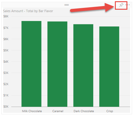
When you are choosing to pin a visualization (either in a report OR already on a dashboard) in the Power BI service, you now have some choices to make. Until today, those choices were made for you. Figure 1 shows a shiny new visualization I created against my Chocolate Sales dataset in a Report.

Figure 1

image

The Pin button is located in the upper-right, as shown by the red arrow in Figure 1. Yesterday, clicking that pinned that visualization to the last dashboard you visited. For me, that was often NOT the right one. And, since there was no way to change this after the fact, I had to delete that visualization (and sometimes entire Reports) and start again after going to the right dashboard, even just for a moment. Gr.

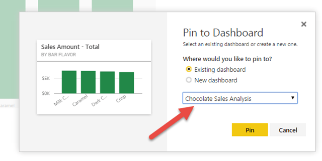
NOW, clicking that Pin button brings up the dialog shown in Figure 2

Figure 2

image

Bam! The dropdown list shown by the red arrow in Figure 2 contains the list of all my dashboards so I can select which one to pin my fabulous visualization to. OR, I can choose New Dashboard and have this be the first visualization on that dashboard.

The post from Microsoft referenced at the beginning also includes the ability to choose whether to use the theme of the dashboard or keep the formatting (colors) you have on the report. That option didn’t appear for me in this case. I’ll have to play with that a bit. For now, I wanted to focus on choosing the dashboard.

I am so very happy about this.

Dr. Seuss

Congratulations!
Today is your day!
You have Power BI!
You’re off and away!

You have data to use.
And questions to ask.
You can do it yourself.
You’re up to the task.
You head to the cloud, with that login you know.
To Power BI; you even have Pro.

You have your dataset already there.
You click on Explore and take to the air!
You click a few clicks and a bar chart appears
With no help at all! Hey, Microsoft: Cheers!

Your dataviz done, you just have to share.
You click on the Pin, and pin it to… where?
It went to some dashboard. You’re not sure which one.
You hope it’s the right one… It isn’t… Son (of a…)

Has this happened to you? Or friends that you know?
It’s happened to me. It ends happy, though.
Do not despair. Do not get the blues.
For as of TODAY: YOU GET TO CHOOSE!

Oh, the places you’ll go, now, when you pin your viz!
I hope I am clear on how awesome this is.

Power BI Weekly Update–Drill, Baby, Drill

In this week’s update to the Power BI service, Microsoft added the ability to drill down into hierarchies. You can read the announcement here. There are some other cool additions as well.

I thought I would take Drill for a spin and share my thoughts.

How to Use Drill

In my Free Power BI account (I have a Free one and a Pro one for testing, etc), I have a dataset related to students selling chocolate for a school fundraiser. I decided to be really cryptic and called it Chocolate Sales.

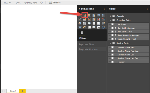
Figure 1 shows the empty palette.

Figure 1

image

To start, I’ll choose my visualization, the simple Column Chart, shown by the arrow in Figure 1. That leads to Figure 2.

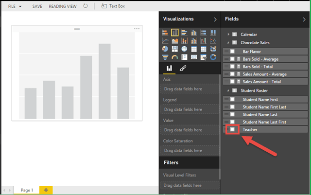
Figure 2

image

Figure 2 shows the empty Column Chart. I’ll click the box for the Teacher field, shown by the arrow. This leads to Figure 3.

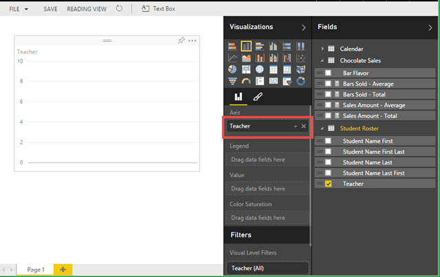
Figure 3

image

The Teacher column now occupies the Axis of the chart. The next step requires some accurate mouse-work. You may want to stretch out a little. You don’t want to pull something. I’ll wait.

<pause>

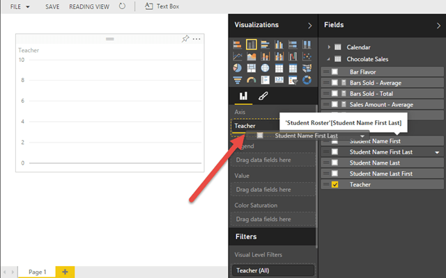
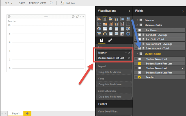
Cool. We want the drill path to lead from Teacher to Student Name First Last. So, when we click on a Teacher column in the chart, we want to drill to a column chart of the students in that class. To do that, we need to drag the Student Name First Last column into the Axis box UNDERNEATH the Teacher, as shown in Figure 4.

Figure 4

image

If done correctly, both Teacher and Student Name First Last will be in the Axis box, with Teacher on the top, as in Figure 5.

Figure 5

image

The order of the fields here is important.  The field at the top of the list in the Axis box will serve as the top level of the hierarchy, ie the top level of the drill path. Each other field below it will serve as a deeper level.

EDIT: I just played around with this more and putting the Student Name First Last ABOVE Teacher in the Axis resulted in the proper behavior anyway. So, perhaps there is some cardinality estimation behind the scenes to ensure proper behavior.

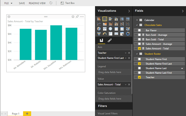
You can add more than one, but we’ll just use one to keep it simple. Our next order of business is to add a measure. For that, we can just choose Sales Amount – Total from the Chocolate Sales table, shown by the Blue arrow in Figure 5. The result is shown in Figure 6.

Figure 6

image

Here we have a fabulous Column Chart. Feel free to take a moment and soak it all in.

<Pause>

Life is good. OK. The default behavior when click on one of the columns is to filter this page of the report according to the value in that column. For example, if we click on Mr. Roboto’s column, it will cross-filter all other visualizations on the page to just Mr. Roboto’s class, as shown in Figure 7.

Figure 7

image

You can see in Figure 7 that the columns for the other Teacher values have become transparent, making Mr. Roboto stand out. Thank you very much, Mr. Roboto, for helping me demonstrate just what I needed to. Thank you. If we had other visualizations on this page, they would be filtered for just Mr. Roboto’s class.

In order to make the new Drill feature work, we have to change this default behavior to something new. First, we can click on Mr. Roboto’s column again to clear that cross-filtering. This takes us back to Figure 8.

Figure 8

image

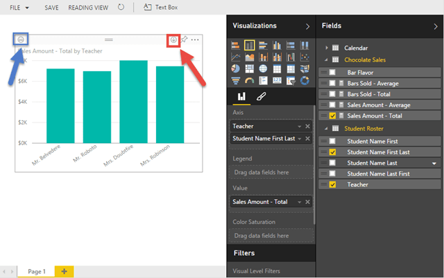
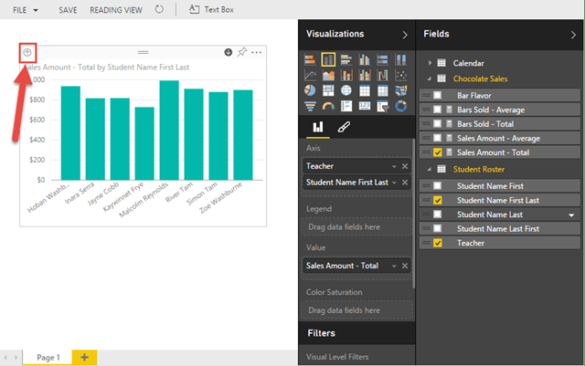
Notice the shiny new icon in the upper right of the chart, shown by the Red arrow in Figure 8. This is the Drill Down button. This changes the mode of the visualization to Drill Down mode instead of the default Cross-Filtering mode. I made those modes up. They are not official names or anything, they just seem to fit with the behavior.

In the upper left of the figure, shown by the Blue arrow, is the Drill Down Level button. We will come to that shortly.

For now, I’ll click the Drill Down button in the upper right, resulting in Figure 9.

Figure 9

image

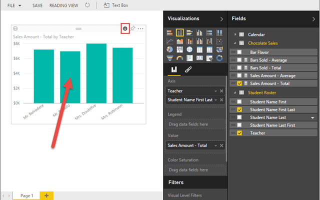
Notice the Drill Down button in the Red rectangle. It has reversed itself: instead of a dark arrow on a light background, it is a light arrow on a dark background. This is the subtle indicator that the Drill Down mode of the chart has been enabled. Now, if we click on the column for Mr. Roboto, we get the result in Figure 10.

Figure 10

image

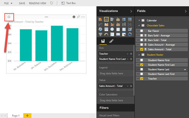
Instead of cross-filtering, we have drilled down one level from Teacher to Student Name First Last, showing the Sales Amount – Total for each student in Mr. Roboto’s class. Hazzah! We can then click the Drill Up button, shown by the Red arrow in Figure 10 to go back up to the Teacher level, as in Figure 11.

Figure 11

image

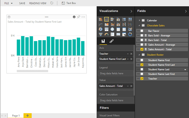
Now, the Drill Down Level button is shown by the Red arrow. This one will take us down to the next level, but apply no filtering. So, instead of getting to the Student Name First Last level for a particular Teacher, we get all of the students, as shown in Figure 12.

Figure 12

image

As you can see, there is a horizontal scroll bar on the chart now, indicating there are too many values to display in the space provided. This is because this chart now holds all students from all four classes.

That sums up the explanation of how to use this new Drill feature. You can turn off the Drill mode, and return to the default Cross-Filtering mode, by clicking the Drill Down button again.

My Thoughts

I am glad this feature is there, for sure. The ability to drill up and down through hierarchical levels is a really important bit of functionality. I also acknowledge that this is just the first pass at it. The fact that the Power BI team is able to keep going with WEEKLY releases here is outstanding. I must confess that I like the way this works in Power View better, where Drill is not a mode for the visualization, but an ability you use by double-clicking instead of single-clicking. That way, you do not have to choose between cross-filtering and Drill. As it is currently, you get one of the other, but not both. I do like, however, the Drill Down Level that lets you go down a level without having to filter. That can be quite handy at times. It will be great, at some point, to be able to guide the Drill to a new report that you have designed for the purpose of being the next level of Drill. But that is getting more structured, for sure, maybe a bit too structured for the current Power BI vision.

I hope you will try this out yourself. Power BI is such an exciting offering from Microsoft. Take it for a spin. If you haven’t already, head over to PowerBI.com and get a FREE account.

Power BI and The Open Bar

Back in July, the mighty Adam Saxton (Blog|Twitter) blogged about there being a limit of 10 reports per Dataset in Power BI. On your attempt to create your 11th report, you would get an error. Adam did point out, though, that you could have many pages within a report. That helped. That post from Adam mentioned above is no longer there because… <pause for effect> that limit has been raised to 200! Hazzah! Bar

I saw some grumbling over the 10-report limit. Granted, 200 is still a limit, but I feel there should be a limit. Power BI, after all, is currently an offering with only two subscription levels: FREE and $10/month. SOME manner of limit only makes sense. And 200 is definitely more than 10. It’s true. I looked it up on the Internet.

When the initial limit of 10 was announced, I asked for info from Microsoft on the maximum number of pages a Report could handle so I could write up a post and help spread the word and make sure people knew they could still do quite a bit even within that limit. When I checked back on the answer recently, I was told (per my Non-Disclosure Agreement with Microsoft) of the impending announcement and the new limit. Grand. That post would not be necessary. Hazzah, again!

This got me thinking, though. I felt the limit of 10 was pretty low and limiting, but I liked the fact that there was a limit. What???? You WANT to be limited???? Yeah. To an extent, I think it is a good thing. Here is the way I see it.

Events I have been to often have bars where people can get liquid refreshments. I, personally, seldom drink alcohol. But the vast majority of my friends do. To them, whether there is an Open Bar or a Cash Bar makes a difference. With an Open Bar, all drinks are paid for by the event rather than drinkers having to pay for them as they get them. With a Cash Bar, the drinkers have to pay as they go. I have often heard it said that an Open Bar leads to a lot more waste as people put their drinks down and forget them and just go get another cuz, hey, it didn’t cost anything. With a Cash Bar, people tend to pay more attention to their drink since they have made an investment of their own. I have not dug around in the data on this, but it seems reasonable, so let’s go with it for now.

When it comes reporting, a lot of organizations I have seen view their reporting environment, like SQL Server Reporting Services, for example, as an Open Bar. There is not a hard limit on reports. So, when in doubt, make a new report. Hey, it doesn’t cost anything, right? Ug. It actually does. Between the dev time for that report, and the testing (sigh, PLEASE test your reports, k?), and then resources involved in maintaining that report and perhaps running it via a schedule and dealing with issues, etc, there is very definitely a cost. When there is a limit on a resource, organizations tend (not always) to think more strategically about that resource. So, if you have a limit on the number of Reports you can create, you will think more about when to create a NEW report and when use an existing one that already has 99% of what the users are looking for. I have worked for several clients in a serious report sprawl situation. They may have dozens of copies of the SAME REPORT with the only difference being a hard coded value referring to a particular customer. Someone needs to learn about Parameters. But, I digress.

Even with this limit being raised to 200 in Power BI, my hope is that people take the few extra moments NOW to consider whether they REALLY need that new report, or if they can accomplish the same thing with what is already there. This hope applies to Enterprise reporting solutions (like SSRS) just as much, if not more than with Power BI.

Still, I have to hand it to Microsoft, here. It is a great example of customer feedback driving a change in a meaningful way. If you have feedback to offer around Power BI, please head over to http://community.powerbi.com/ and make your voice heard. Whether it be an idea for a feature or even just a question, the Power BI Community site is a great place to go.

My Full-Day Power BI Pre-Con for SQL Saturday 453 (Minnesota)

Greetings, friends! I am delighted to announce that I will be providing a full day pre-con on Power BI as part of SQL Saturday #453 in Minnesota in October. Woohoo! As you might guess, I am really excited about Power BI. Been there, done that, got the t-shirt. It’s the old branding, but that’s fine for now. Hey, Microsoft, if you want to send me one with the new branding, I wear an XL. Thanks.

Embedded image permalink

You have a PowerBI.com account, right? Right? Get a FREE one here.

I love the way Microsoft has been enabling users with the self-service offerings over the past few years. With Power BI, they have not just created a new offering, they have established an ecosystem for growing the Data Culture in pretty much any organization. Below is the abstract for this pre-con that just barely scratches the surface of what is possible with this fantastic technology. With their plan to release updates to the PowerBI.com service on a weekly basis and Power BI Desktop on monthly basis, it will be even better come October. 🙂

Click, Click WOW: The Exciting World of Power BI

With Power BI, Microsoft makes working with data even easier… AGAIN. After years of enabling IT and Power Users, they have released a new set of capabilities that truly enables EVERYONE. The NEW Power BI includes a cloud service, PowerBI.com, as well as a FREE, standalone application that combines Power Query, Power Pivot, and Power View into a single environment completely independent of Excel called Power BI Desktop.


This Pre-Con will cover the entire Power BI user experience, from creating dashboards in the Service to using Power BI Desktop to create data models that help you get the answers you need.


Power BI Service

·         What is Power BI?

o   General offering overview

·         Datasets

o   Importing data from a number of sources, both on-premises and in the cloud

o   Scheduling data refresh

·         Reports

o   Visualization overview

o   Pinning Reports to a Dashboard

·         Dashboards

o   Putting it all together in Tiles

o   Using natural language search to create new Tiles

o   Sharing your Dashboard with others

·         Configuration

o   Setting up the Power BI Personal Gateway to access on-premises data

o   Managing Groups for sharing and collaboration


Power BI Desktop

·         Getting/Transforming Data (Power Query)

o   Importing data from a number of sources, both on-premises and in the cloud

o   Renaming, combining, splitting columns

o   Changing formatting like Capitalization and removing unwanted spaces

o   Creating new columns

o   Replacing invalid values

o   Brief introduction to the M language

·         Designing Your Data Model (Power Pivot)

o   Creating relationships between tables

o   Using DAX to bring your model to life

o   Modeling and DAX Best Practices

·         Visualizing Data (Power View)

o   Choosing from the vast array of visualizations

o   Configuring visualizations for color, formatting, etc

o   High-level data visualization best practices


Microsoft’s goal with Power BI has been, “Five minutes to WOW!” Imagine how many WOWs we can get in a full day pre-con!