The other day, there was a question posted on the #ssrshelp hash tag on Twitter. The question was whether SSRS would allow you to show data labels for a chart, but ONLY on the last item in a series. For example, if you have months ranging from January to December, can you show the data label only on December’s value?
You can indeed. Here is how you do it.
Let’s start with a basic data set query (the source does not matter since were are hardcoding everything here.
SELECT     '2011-01-01' AS ValDate, 1 AS Val
UNION ALL
SELECT     '2011-02-01' AS ValDate, 2 AS Val
UNION ALL
SELECT     '2011-03-01' AS ValDate, 1.5 AS Val
We’ll call it Dateset1. It returns the following:
Let’s see a chart based on this data with the data labels turned on.
This is basic stuff. Now, let’s add the necessary items to hide all of the data labels except the one for 2011-03-01.
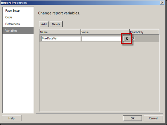
First, we’ll add a new Report Variable. Click on Report and choose Report Properties.
We create a new variable called MaxDateVal. We then click on the Expression button, shown in the rectangle above.
Don’t worry about the red underline here. Click OK when you’re done.
Now we head over to the Visible property of the Chart Series data labels, shown below in the rectangle near the bottom.
Click on the property value and choose Expression.
Enter the following expression.
Click OK and then run the report.
Notice only the MAX date value, 2011-03-01, has a data label now.
Have fun.
Categories: SSRS


Nice and included a report variable:) The variable is actually not needed, you could simply place that logic in the expression directly. If you are going to reuse that logic thought it is nice to centralize it though.
LikeLike
I agree that the Variable isn’t specifically required. I could have noted that, I suppose. I just like how clean it is and that it is re-usable easily. I am a big fan of Report Variables. 🙂 Thanks muchly.
LikeLike
Any advice on how to have data labels that show totals for each bar of a stacked bar chart?
LikeLike
Hi Hank. I remember wrestling with that on a project a few years ago. The issue is the a data label will map to a data point in your data set. And, by having a data point in your data set that represents the Total, it will want to display along with the other data points and end up just being another stack in the one bar. If memory serves, I tried something like this: http://road-blogs.blogspot.com/2010/06/display-total-on-top-of-stacked-chart_8589.html
I hope that helps.
LikeLike
I have a customer who wants the y-axis limits fixed, and occasionally one of the columns is too big to fit on the chart. In this case he’d like the data label displayed (only in this case). but unfortunately it doesn’t appear as the top of the column is off the chart.
Any idea how to get a label on the column in this case?
Thanks.
LikeLike
Hi, John. The Data Labels properties for a column chart have a Position property. Setting it to Top will place the label above the bar. Setting it to Bottom will place the label at the top of the bar still, but inside the bar itself. You can control this with en expression that will determine dynamically for each bar. the default for this property is Auto, which lets SSRS make the choice for you. But i have found occasions where it chooses poorly. I wrote a vb function for this that, while probably not the best vb ever, handled this the way I wanted it each time. I will dig that up and blog it and hopefully that will help, too. In the meantime, try messing with the Position property of the Data Labels. Hope this helps.
LikeLike
I have a stacked column report with data ranging from 0 to 12mil. When a value along the x-axis is low, say 350k, SSRS is placing the label where you can only see the top half of the value, the bottom half is being cut off by the x-axis line. In general, SSRS places stacked column labels INSIDE the column. So when you have a small amount there really is no where INSIDE the column to place the label. Any ideas on how to position a column label so that it appears completely above x-axis? Smartlabels dont seem to work.
LikeLike
Hi, Mike. The link here http://technet.microsoft.com/en-us/library/dd220469.aspx indicates that for Stacked Bars, the data label can only go inside the series. I have, however, dynamically hidden the label when the value is small enough that the label would not fit. It take a little trial and error, but you can do this pretty easily with the Visible property on the Chart Series Labels. I hope this helps.
LikeLike
Hi Guys. This has been really useful. I managed to get it to show the maximum and minimum labels only (to show the range of data and the points on which the min and max fell) on a line chart. How could I do this for a multi-series line chart to show for each series…?
LikeLike
Hi, Rob. If the Series values are fixed, you could create a variable for each. Then, in the expression, reference the matching variable or each using a SWITCH(). That is just off the top of my head. It has been a while since I have played in SSRS land.
LikeLike
Mark – Thanks for the response. I sorted the visibility out using this expression
=iif((fields!Expr1.Value = Min(fields!Expr1.Value,”Chart1_SeriesGroup”)) or (fields!Expr1.Value = Max(fields!Expr1.Value,”Chart1_SeriesGroup”)),True,False)
in the label/visible section of the chart series.
LikeLike
Thanks for the info, sorted my problem out 🙂 Cheers
LikeLike
Sweet! Thanks for sharing, Scott.
LikeLike
Thanks. It worked for me.
LikeLike