An SSIS Training Video by Webucator

Greetings, noble readers!

A while back, Webucator, an organization that produces training videos on a number of topics, contacted me about doing a video walkthrough of one of my blog posts. The original post is Making Your SSIS Configuration Files More Readable. Their video walkthrough is here.

Feel free to check out this video and their others as well.

In the interests of full disclosure, I was in no way compensated for this and have no relationship with Webucator other than this video.

Brian Piccolo, Thanks, and the Number Five

6144002147_a5f02feee3_bThere have been a few times in the past few days that I was really reminded about the power of gratitude. The first came when I brought my third grader’s lunch to school for her after she forgot it at home. As I was leaving, she said, in the cutest little voice and full of joy, “Thank you, Dad!” It was one of those heart melting moments. In that moment, the words “thank you” translated as “I love you with the white-hot intensity of a thousand Suns.” Powerful stuff, that. I walked out of that school with a spectacular smile on my face.

The other came in the form of an email from a member of our fine SQL community. I’ll get to that in a moment. First, I want do some of my own thanking.

I have been pretty active in the SQL community over the years, mostly centered around PASS events and user groups. I have presented a lots of SQL Saturdays, the last three PASS Summits, several user groups both in person and remotely. And I have met a lot of people at various stages in their careers. I love that aspect of the community we call #SQLFamily. There were people early in my career that had a huge impact in pushing me into this community. Given that gratitude is a major theme of this post, I want to take a moment to call out two people who had a huge impact on me and my career. Lara Rubbelke (Blog|Twitter) and Jason Strate (Blog|Twitter) both encouraged me to jump into the community when I first started out as a consultant. They not only pushed me in a positive way, but they showed me how as well. They led by example. I will always be grateful for their influence.

1132534644_e8e3f986fa_oNow, onto that email mentioned above. I am going to keep the sender of the email confidential. However, I did get permission to use a few quotes from it for the purpose of this post. I hereby say, “Thank you” to that person. Hehe.

The email discussed how this person has done a lot in the past year to help out their local user groups and started doing presentations as well. They had felt the urge to stop and thank me for a conversation we had about a year ago. “This random bit of email comes to you as I sit here late at night putting the final touches on another presentation to be given. And I just felt the need to take a break and say thanks.” I have to say that is pretty cool. Taking the time to thank people for the help they provide others is something I believe in very strongly. To me, even simple things are well worth a Thank You when they provide value, no matter how small.

My advice to people in any community is to make sure to thank the people that help you. Whether they answer a question for you that helps you solve a problem or just quietly inform you of that piece of lettuce stuck to your teeth, they are making an effort to provide value. Thanking them helps reinforce their decision to help others. It helps move everyone forward.

“Thank you for taking a few moments out of your day last summer to encourage and motivate a random stranger…” The email continues. “To me, it is irrelevant if you recall the 5 minute walk to the parking garage after the event. What is relevant, is that you took that time to listen and encourage a wise cracking … guy to pursue his dreams. That chance encounter was a huge motivator for me to want to become more involved.”

Enter the number five. Here is someone thanking me for a casual conversation that lasted about five minutes and happened a year ago. Five minutes. By the way, I do remember the conversation. I had no idea, at the time, the impact those few minutes would have. It felt totally awesome to learn about this.

Brian Piccolo was a running back for the Chicago Bears in the late 1960s. My English teacher introduce me to Brian in eighth grade via the movie Brian’s Song. Gale Sayers was another running back for the Bears at the time and known for long runs. There is a quote from Piccolo that I always liked: “I won’t get you 60 yards in one crack like Sayers, but I’ll get you six yards ten times in a row.” My teacher had paraphrased it for us while we discussed the film: “I won’t get you 60 yards, but I’ll get you ten sixes.” That has always stuck with me.

So, what does this have to do with this post? To me, that line is a reminder that you don’t have to do huge flashy things to make a difference. You don’t have to move mountains to be of value. Sometimes, making a huge difference can be as simple as a five-minute conversation. I have friends that write books and teach classes and travel the world as super experts. These people provide a ton of value to the community. Just don’t think you have to do just as much as they do in order to matter. Start small, but start. Do something for someone, even if it’s something you think is tiny and may not matter. Do it anyway. It could matter a lot to the person you help.

Achievement Unlocked: Microsoft Employee

After almost 9 years of consulting around SQL Server and other Microsoft Data Platform technologies, I have joined Microsoft. Today was my first day as a Cloud Solution Architect – Data Platform. Basically, I will be helping Microsoft customers by designing data solutions using Azure (both pure cloud and hybrid). My role is in Minneapolis, so I won’t be moving. There will be a little bit of travel here and there as I have onsite meetings with customers.

I will need to learn a LOT more about Azure than I currently know. That is a large part of what made this opportunity so attractive. My content here will start having more of an Azure bent to it as I dig deeper into it. There will still be some Power BI here and there as well.

I am incredibly excited about this new direction. Microsoft has really been doing such exciting work and I am proud that I will get to be a part of it.

Cross Filtering Versus Slicers In Power BI

This post is inspired by a question on the Power BI Community site: PBI Graph Scaling. The question relates to the behavior of scaling of graphs when using Cross Filtering in a Report. It seems, as Seth Bauer (Eno1978) pointed out, that they may want to use a Slicer instead.

I figured an analysis of the behavior of cross filtering and slicers would help people learn what to expect in each situation and guide folks in choosing which feature they want to use. For this example, we will use the report shown in Figure 1 relating to student chocolate bar sales for a fundraiser.

Figure 1

image

This report features three visuals in Power BI Desktop:

1. Column chart showing Sales Amount – Total by Flavor

2. Bar Chart showing Sales Amount – Total by Size

3. Slicer allowing for filtering by Size

Cross Filtering

Cross Filtering is the feature that allows clicking on a part of a visual, like a Column in a Column chart, and filtering all other data on the Report page to highlight the values associated with that Column. Doing this allows for comparison to the full totals by leaving references to data not meeting the filter in each visual, but shown faded. For example, if we click the Large bar in the Sales Amount – Total by Size Bar chart, we will filter the visuals to highlight the values relating to Large bar sales as shown in Figure 2.

Figure 2

image

Note that the values for the Small bar sales are still visible for comparison, but are clearly lightened so that the Large sales are easily seen. We can return to the unfiltered view by clicking the Large bar again.

Slicer

Slicers actually remove the values that do not meet the filter from the visuals entirely. For example, if we click the Large option on the Size slicer, we get the view shown in Figure 3.

Figure 3

image

Notice in this view that the Small bar has been completely removed from the bar chart. With quick comparison to Figure 2, you can also see that the scale of the column chart has changed so that the top value is just over $3k, which corresponds to the columns in the cross filtered version. The portion of the sales corresponding to the Small bars is completely removed.

Incidentally, the behavior of a Slicer matches the behavior you would see if you put the Size field in the Filter area at the Report or Page level.

Conclusion

As we can see, the behavior of cross filtering is certainly different from the behavior of using a Slicer. Cross Filtering allows you to see how the filtered value(s) compares to the overall total. A Slicer filters such that only values meeting the filter are allowed to appear at all. There are occasions when one or the other might be preferred. Understanding which is which will save you time and effort while visualizing your data with Power BI.

While the example here is from Power BI Desktop, the behavior in the Power BI Service is currently the same.

Note: The behavior here is current as of October 15th, 2015. It is subject to change in the future as Microsoft continues to make the awesomeness of Power BI even better.

Current Power BI Service Limits

Not long ago, Microsoft announced that the limits for Datasets and Reports per Dataset had been increased to 200. You can read their announcement here. That raised some additional questions for me. I asked Microsoft and have now gotten the answers I sought.

Please note that these answers are valid as of September 23, 2015, but are subject to change in the future.

image

Datasets

A Dataset is a connection to a single source of data, a single file, a single database, etc. So, this means you can connect to up to 200 distinct sources from your Power BI service account. Note that a Power BI Desktop file, which can connect to many sources at once, counts as a single Dataset in the Power BI service. Therefore, effective use of Power BI Desktop raises your limit of data sources well above 200.

NOTE: I don’t, as of the time of this writing, have the limit on sources supported by a Power BI Desktop file. I will provide that info once I have it.

Reports per Dataset

A Report in Power BI connects to one and only one Dataset. If you think 200 Reports per dataset does not seem like much, remember that Reports can have multiple pages of visualizations. I don’t have a maximum on number of pages at the moment.

NOTE: I got confirmation from Microsoft that tiles created via Q&A DO NOT count against this 200-Report limit. So, with effective use of Q&A for creating Dashboard tiles, you can get a lot of mileage out of 200 Reports by only using them for things that a Q&A tile cannot do.

Reports

With 200 Datasets each supporting up to 200 Reports, some simple arithmetic leads to the conclusion that you can have up to 40,000 Reports in your Power BI account. I have not seen an Enterprise environment with anything close to that number of Reports. I would think they could be out there, but, still: That’s a LOT of Reports.

Dashboards

You can have up to 100 Dashboards in your Power BI account. To me, this is the most limiting out of all of these numbers. The reason is that there is no real wiggle-room here as there is no comparable alternative to Dashboards. While there is not a technical reason that dictates your Dashboard tiles have to all fit on a single screen without scrolling, it is definitely a best practice to keep them to a single screen. Still, if you remember that your dashboards should be for the MOST important information that needs to be seen at a glance, you can make good choices about what gets pinned to Dashboards and what stays on the underlying Report(s). Keep in mind, too, that Dashboards can support Tiles from multiple Reports and from multiple Datasets via Q&A. So, it is possible to to have multi-purpose Dashboards if you are approaching this limit. That said, I would recommend you avoid mixing unrelated data in the same Dashboard as it could create confusion and make the Dashboard less effective overall.

Conclusion

There you have it. I hope that provides some clarification. I have to say, for a service with the elegance and flexibility of Power BI, and price points of FREE and $10/Month, these limits are VERY generous.

PASS Board of Directors Election

Greetings. It’s time to vote for the open PASS Board of Directors positions. I want to start by thanking some folks.

Thank you to the Nomination Committee for their time and effort on this process:

Bill Grazziano
Grant Fritchey
Robert Davis
Lori Edwards
Bob Pusateri

I would like to thank the four candidates, all of whom have shown a passion for this community, not just with their words, but with their actions.

Ryan Adams
Tim Ford
Argenis Fernandez
Jen Stirrup

This is never an easy decision to make. I know each of these great people and have no doubt that the outcome would be great for PASS for any of them to sit on the Board.

Here are my votes, with the rationale behind each.

Jen Stirrup

I know that Jen is the only candidate for EMEA and a vote here isn’t really necessary. I am voting for her anyway because I have tremendous respect for her and the work she has already done on the PASS Board. I love how great she has been in terms of transparency. I love how she has served as a champion for the data professionals out there that aren’t DBAs or Database Developers. While the core of PASS has long been, and continues to be, with our Database Administrators and Developers, it is vital, in my opinion, for PASS to also embrace the data analysts, data scientists, and consumers of data. One way is via the PASS Business Analytics Conference. Our DBA and Database Developer friends put a lot of time and effort into helping to store our vital data and keep it safe and secure. We keep and safeguard that data so we can USE it. Jen has served well in speaking for those people.

Tim Ford

Tim has shown excellent leadership in continuing the success of the SQL Saturday program, which I believe in very strongly. To me, between his direct involvement with SQL Saturdays, his efforts on SQL Cruise are also fantastic. I hope to do one some day. 🙂 I think Tim has demonstrated his passion and ability to lead and I would like to see him continue those efforts. I do also appreciate his support for the PASS Business Analytics Conference and serving that community.

Ryan Adams

I met Ryan Adams when I was a PASS Regional Mentor. We chatted at a Regional Mentor’s meeting at PASS Summit and participated in discussions at the PASS Chapter Leaders meeting as well. I was amazed to hear how he performed that role. I was amazed at his organization and his passion for his chapters and for PASS. He made me want to be a better Regional Mentor myself. I chatted a bit with the Chapter Leaders in his region. They were in awe at how helpful he was for them and had nothing but praise and appreciation for Ryan. I knew during those conversations that it was only a matter of time before I would see his name on a ballot for the PASS Board. I also knew that I would vote for him when it happened. The time has come.


I mentioned that this is a very hard decision. Argenis is a brilliant SQL Server professional with a tremendous passion for this community. I think he is a great candidate for the PASS Board. I have every confidence that we will see his name on a ballot again. At this time, I feel that my three choices above are the ones I need to make.

My fellow PASS members, I implore you to vote. Please make your voice heard.

Power BI Weekly Update: Oh, The Places You’ll Go

Microsoft has released this week’s update to the PowerBI.com service. You can find the details here. There are a few updates this week, but I want to focus on just one.

How many times have I added a Dataset and created a Report only to discover I did so in the context of the wrong dashboard? OMG so many times. I am a slow learner, apparently. Well, it no longer matters.

As of TODAY, when pinning a visualization to a Dashboard in the Power BI service (PowerBI.com), you get to select which Dashboard to pin it to. What??? I know! So cool. Not only that, but you can ALSO choose to create NEW dashboard during this process instead of pinning to an existing one.

I have broken this post into two sections. The first section will be a straightforward blog post on this new feature of Power BI. The second section will cover this feature again, this time via poetry as I channel my own inner Dr. Seuss.

Straightforward

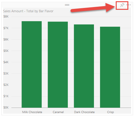
When you are choosing to pin a visualization (either in a report OR already on a dashboard) in the Power BI service, you now have some choices to make. Until today, those choices were made for you. Figure 1 shows a shiny new visualization I created against my Chocolate Sales dataset in a Report.

Figure 1
image

The Pin button is located in the upper-right, as shown by the red arrow in Figure 1. Yesterday, clicking that pinned that visualization to the last dashboard you visited. For me, that was often NOT the right one. And, since there was no way to change this after the fact, I had to delete that visualization (and sometimes entire Reports) and start again after going to the right dashboard, even just for a moment. Gr.

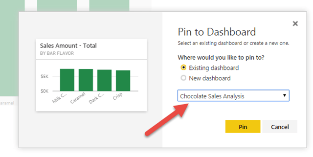
NOW, clicking that Pin button brings up the dialog shown in Figure 2

Figure 2
image

Bam! The dropdown list shown by the red arrow in Figure 2 contains the list of all my dashboards so I can select which one to pin my fabulous visualization to. OR, I can choose New Dashboard and have this be the first visualization on that dashboard.

The post from Microsoft referenced at the beginning also includes the ability to choose whether to use the theme of the dashboard or keep the formatting (colors) you have on the report. That option didn’t appear for me in this case. I’ll have to play with that a bit. For now, I wanted to focus on choosing the dashboard.

I am so very happy about this.

Dr. Seuss

Congratulations!
Today is your day!
You have Power BI!
You’re off and away!

You have data to use.
And questions to ask.
You can do it yourself.
You’re up to the task.
You head to the cloud, with that login you know.
To Power BI; you even have Pro.

You have your dataset already there.
You click on Explore and take to the air!
You click a few clicks and a bar chart appears
With no help at all! Hey, Microsoft: Cheers!

Your dataviz done, you just have to share.
You click on the Pin, and pin it to… where?
It went to some dashboard. You’re not sure which one.
You hope it’s the right one… It isn’t… Son (of a…)

Has this happened to you? Or friends that you know?
It’s happened to me. It ends happy, though.
Do not despair. Do not get the blues.
For as of TODAY: YOU GET TO CHOOSE!

Oh, the places you’ll go, now, when you pin your viz!
I hope I am clear on how awesome this is.